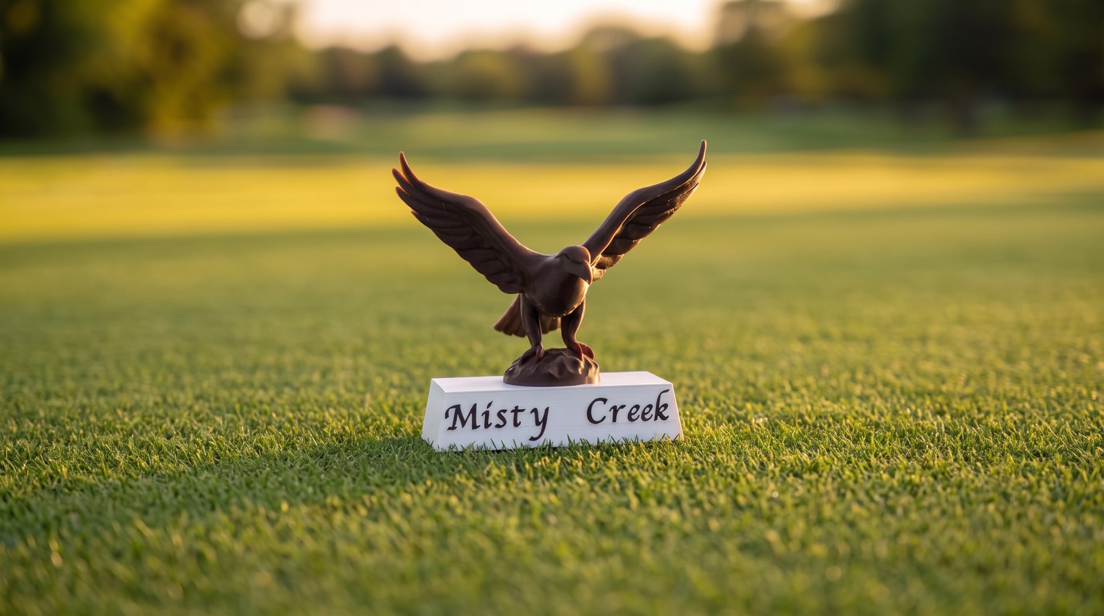
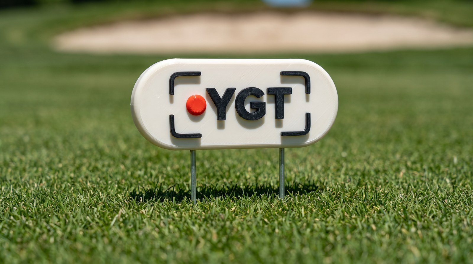
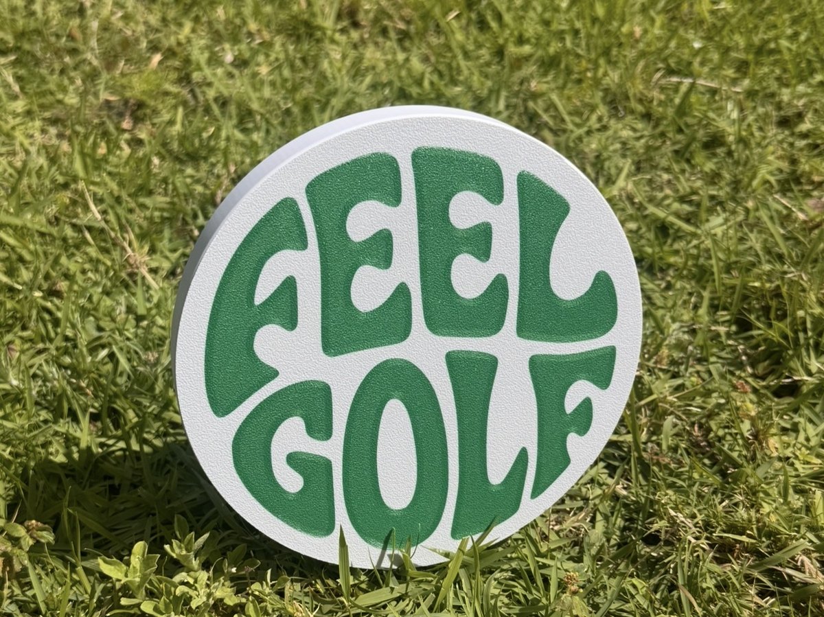
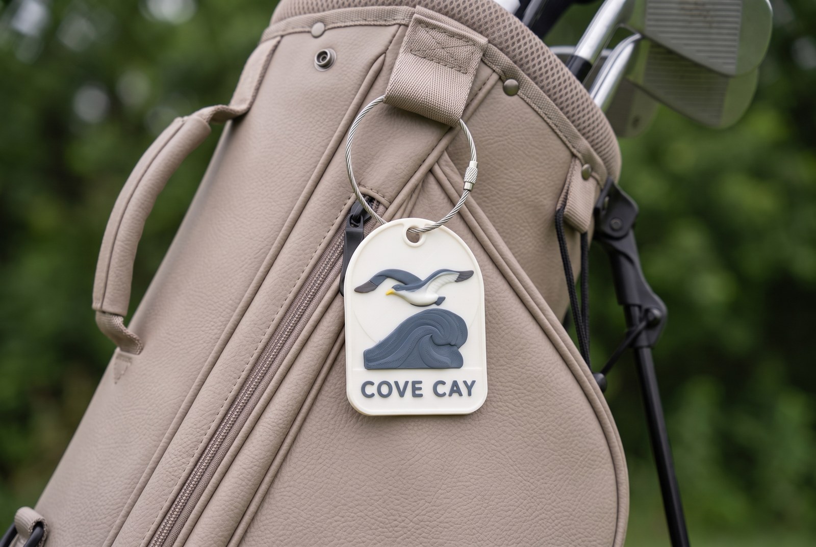
Every course already has an identity — a name, a mark, a feature people remember. These pieces take that identity and plant it where the round begins, so the tee box feels unmistakably like this place and no other. The catalog spans styles because each course is claimed on its own terms.

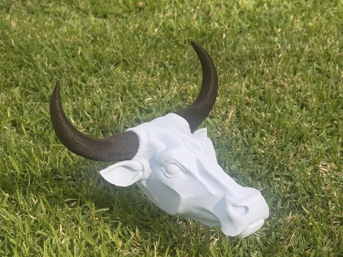
The course is named for a sound, so we gave it a face. The Green Man turns “Whistling Straits” from a line on a scorecard into a character that greets every group at the tee — a small landmark players photograph and remember the course by. Offered as a family of colorways so the course can set the tone that fits its own ground.

For a tour that doesn’t own its courses, the tee box is borrowed ground. This piece claims it — for a day, a weekend, a season, the marker tells everyone who’s playing here and whose tour they’re part of. It gives a traveling brand a fixed point on the course, something players photograph, stand beside, and remember the tour by.
Earlier commissions and studio reference pieces — from miniature statuary to clean sponsor work.

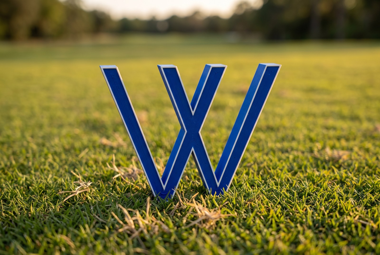
The club's emblem stood up at the tee, so the mark players already know greets them at the start of the hole.

Turns an ordinary tee into the event's own ground — the detail that makes the round feel like it counts. Shown as a design study.

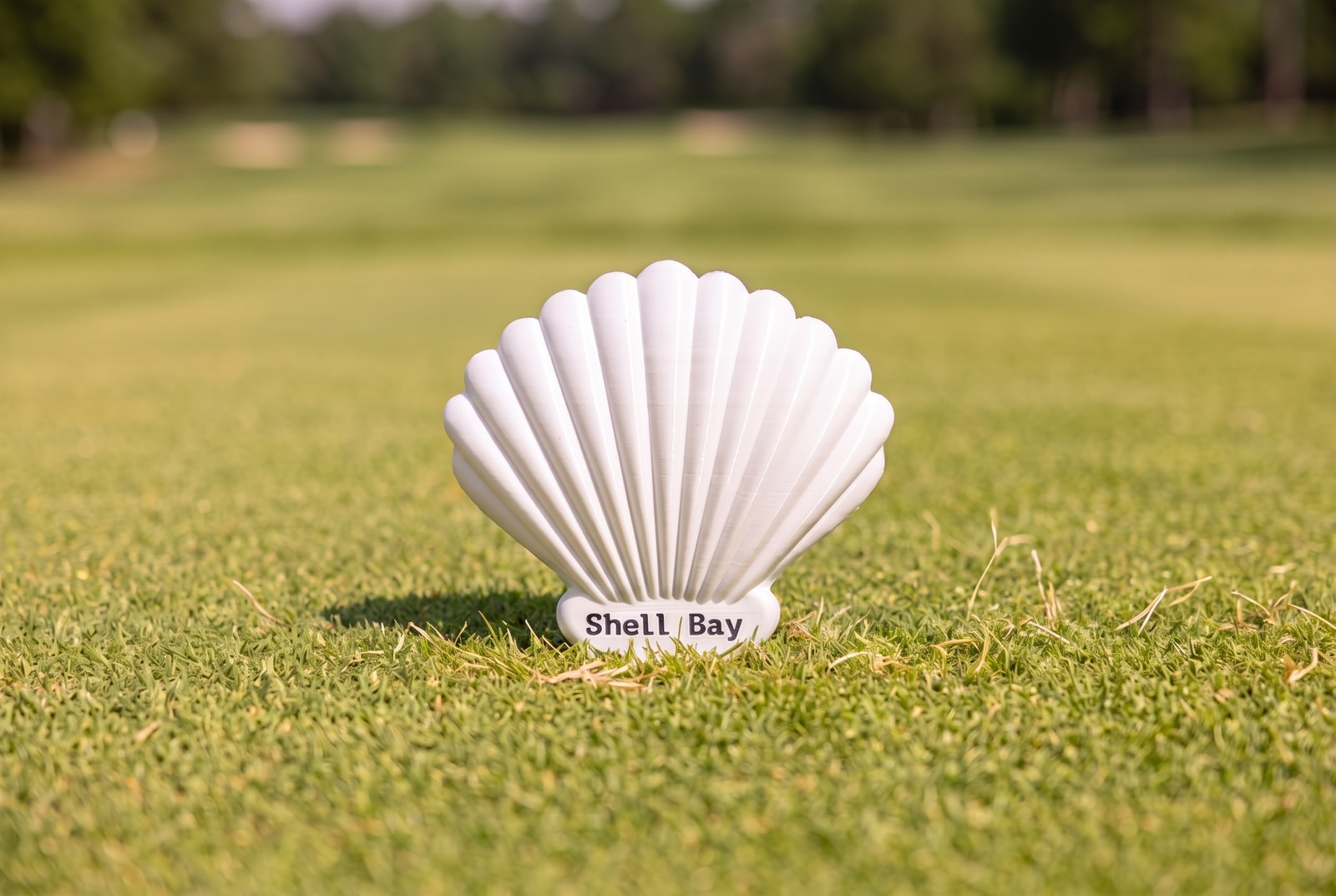
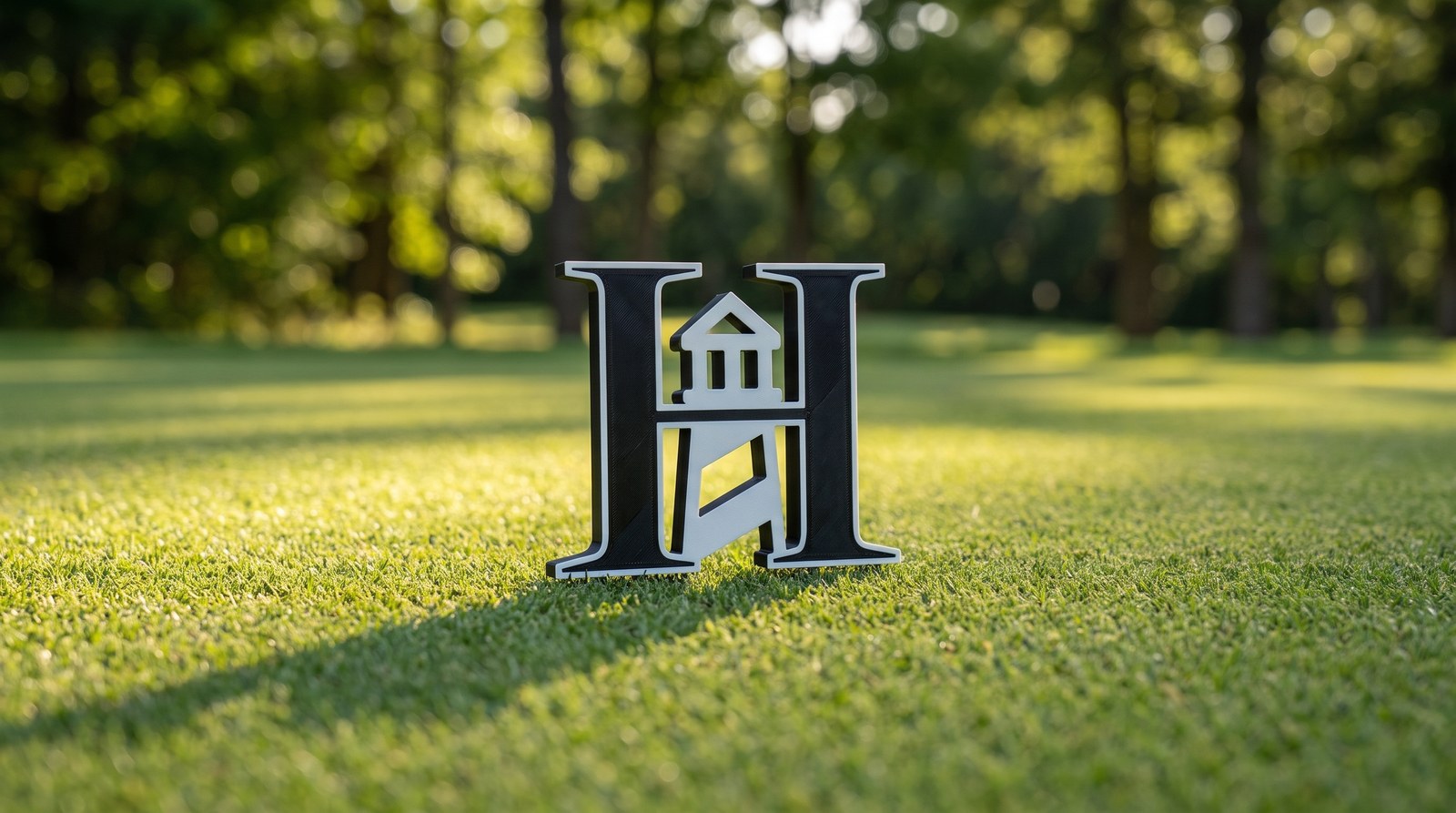
Ties a club's name to the landmark it's known for, so the first thing players meet at the tee is the course itself.

A flat mascot brought to life at the tee, so the emblem greets players as a real object. A study in figural work.

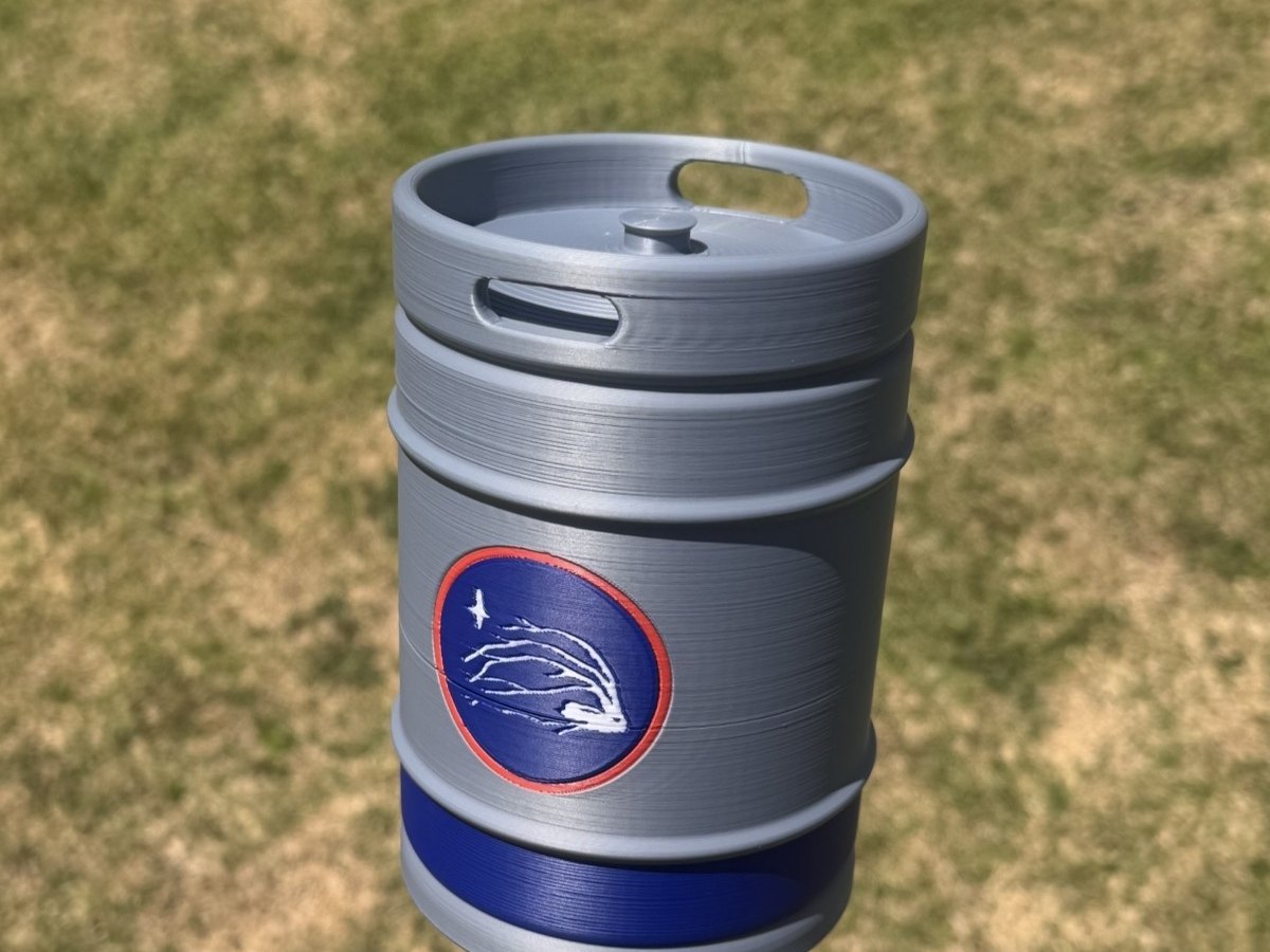
A sponsor that's easy to forget on a banner, made part of the round itself — a landmark a logo on signage never becomes.

An in-house study in pushing an identity — the groundwork that lets a commission start from your mark, not a template.

A creator's mark made to live on the course, not just the feed. A real piece for a creator we've worked with directly.

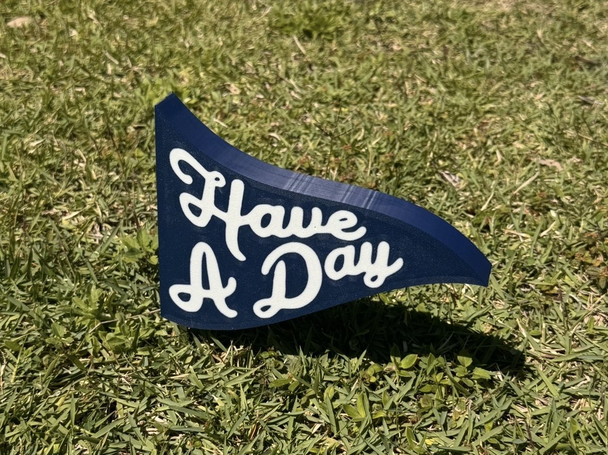
A creator's catchphrase planted at the tee, instantly recognized by their community. Made and gifted to a creator we've met.